Prized AdobeCS Year Subscription!
Client:
Adobe Creative Jam
Role:
Product Manager, UI Designer
Project Duration:
5 Days
Tools:
Slack, AdobeXD, Zoom, Google Meetup, Google Forms, Google Slides,
Project Summary
Over a 5 day sprint, design a third-party mobile app to help underrepresented creatives access hiring opportunities, showcases, communities, and/or resources that ultimately empower them and allow them to thrive. Teams must use Adobe XD when creating application prototypes and be accompanied by a 150-word abstract summary.
UX Team Members:
Monica Lee, Colleen McHale
The Project Goal
Choose a which group define underrepresented group as the app users.
Narrow in on who we are communicating with, our audience.
Encourage continue usage of the application
Make the solution different from others. With 150 teams, be original and inclusive.
Team Brainstorming
After the project kickoff, us 3 designers got together over Zoom to discuss some potential ideas. There were many great solution examples floating around in the world our team took inspiration from .
Etsy
Patreon
LeanIn.org
Who might we be designing for?
Our design team created a proto-persona for our User to help come back to throughout the design process. This persona had separate needs than the customers using the app.
Next, our team formulated a proto-persona for the customer experience to come back to during the design process. This experience needed an easy way to navigate the app and way to find new artists or group to support.
The Design Process
Ideal User Flow
As a team, we felt it important to conceptualize a user flow before designing. Mapping out the customer experience might help better address the user’s needs when creating the solution.
Highlighted Features
To make a greater impact with our app, our team came up with some very important features we felt needed to be included in the prototype, along with our user flow. These features adhere to delivering to our overall project goal of focusing on underrepresented BIPOC creatives and individuals.
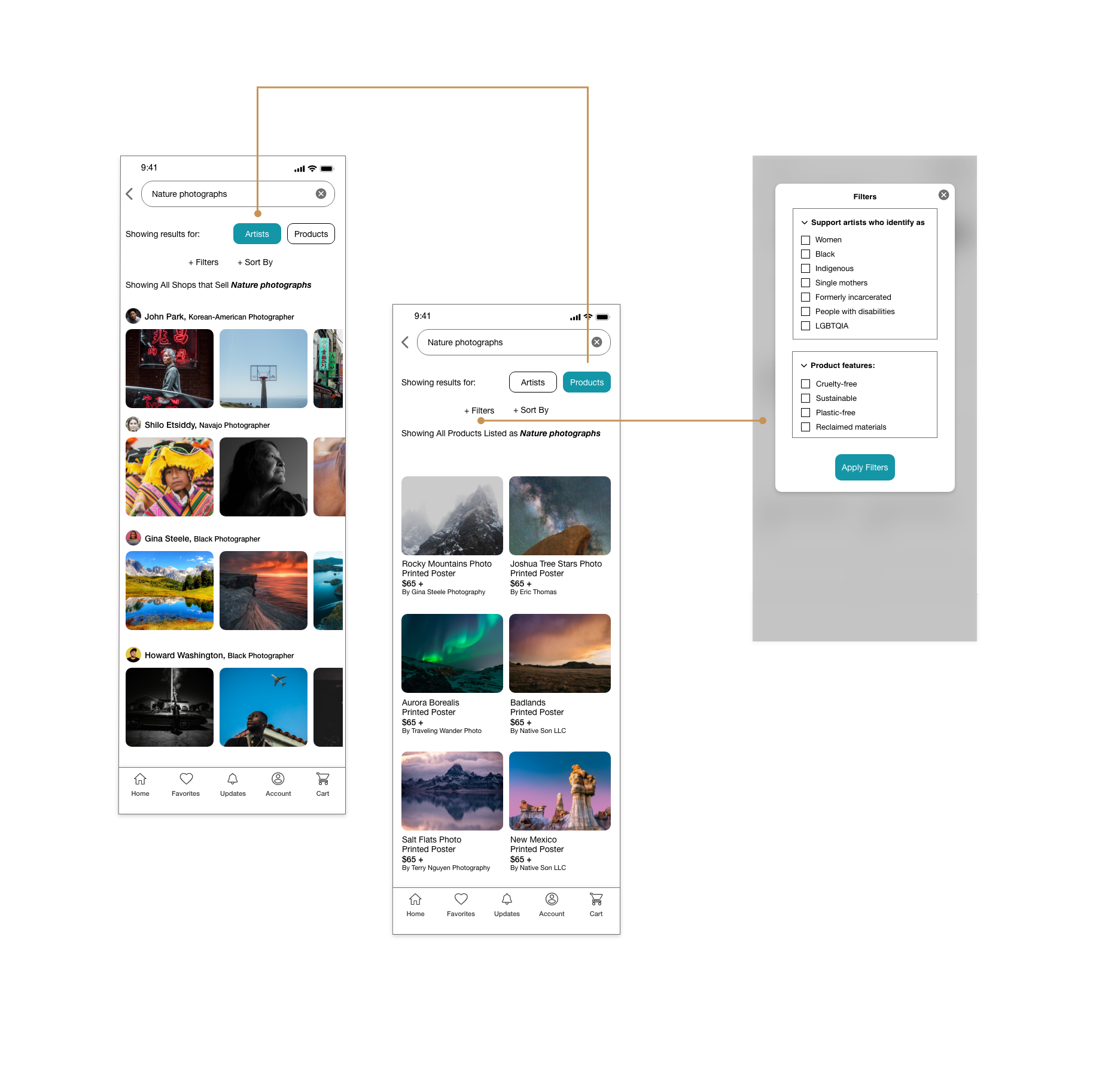
Filtering
Keeping our customer in mind, they needed an easy way to toggles between artists and products. We created two categories to help sort search results.
In addition, customers could filter through key artist identifiers and sustainable product filters.
Pay Gap Feature
Racial and Gender pay gaps are a real issue, worldwide. We wanted to shed light on educating the customers on the subject and allowing them to close that pay gap with each transaction.
In the Prototype, our design team built in a special feature allowing user’s to set their account to have the ‘Equal Pay’ feature for their commerce products.
Customers would show their support by paying a little extra for the product, but feel responsible for closing pay gaps.
Artist Sponsoring
Colleen had shared great ideas of other ways to support creatives without needing to get something physical in return.
Our team created a ‘Sponsor’ page for the User’s account. This page had 3 levels of monthly contributions that would act as a reoccurring financial pillar for users.
Customers would be able to sponsor their favorite creatives on several levels and in return get exclusive unveilings into the artists new work.
The Prototype
Contest Results
Although other teams were chosen as the winners for Adobe’s Creative Jam, our team was gifted a free year of Adobe’s Creative Cloud. The experience to design in Adobe XD for this contest, changed my mind on which program I want to continue to create in as a designer.


