Client:
Case Study
Role:
UI Designer, Experience Designer, VR Developer
Project Duration:
3 Weeks
Tools:
Sketch, Unity Hub, Unity Store, Github, Oculus, Google Drive
Project Summary
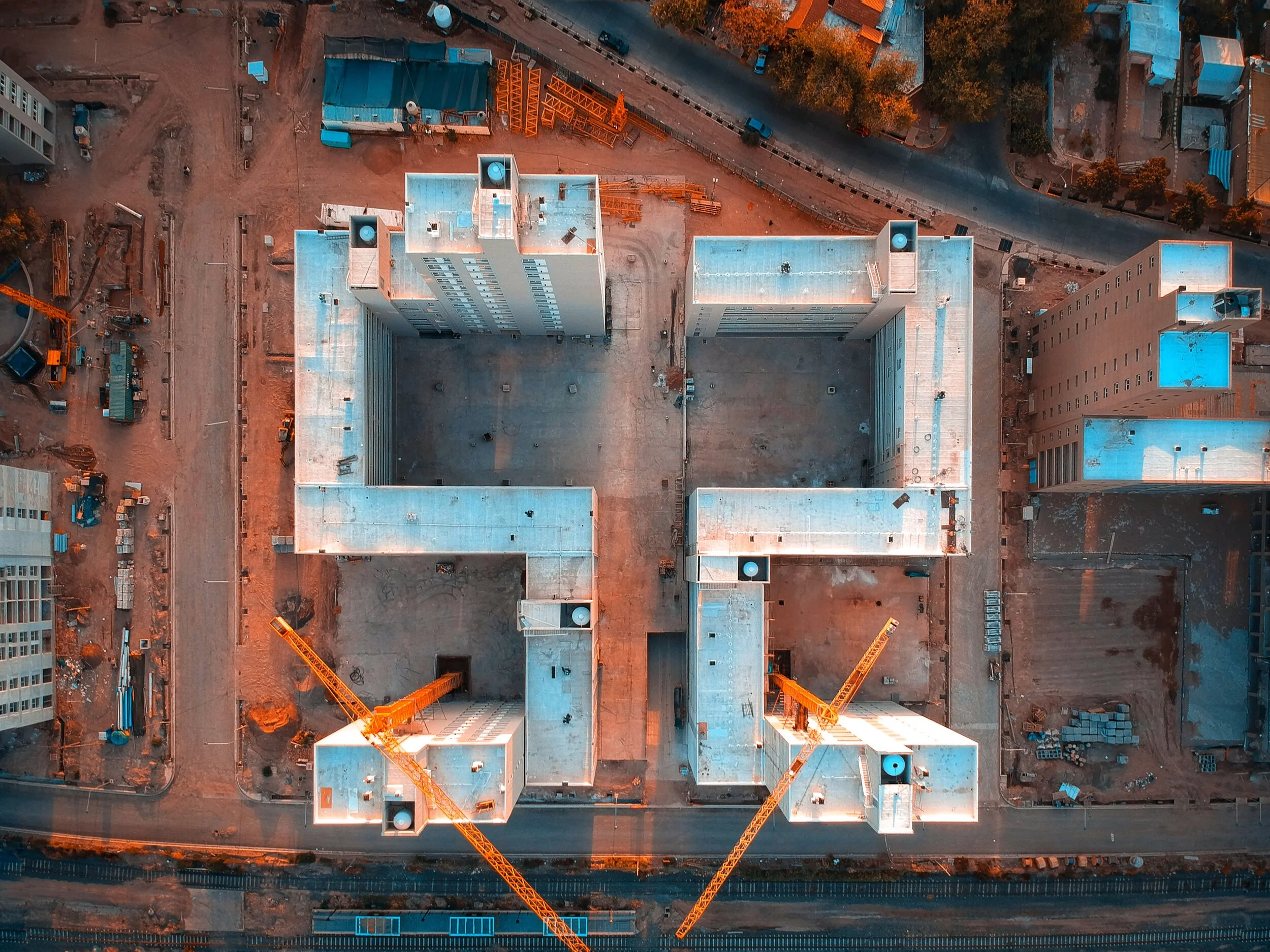
In this Capstone Project, I designed and developed an optimized construction VR application, complete with a construction environment, interactive scene objects, UI menus, a site tour, locomotion, lighting, polish, and animation.
The Ask
In an effort to update the client on their ‘52’ building project, create a VR application to showcase the interactivity of the construction site in its current stages.
After brainstorming on the client brief, I put together a design process highlighting a high-fidelity virtual construction site with user locomotion, intuitive UI navigation, and a vast list of demonstrated features.
Project Criteria
Outlining my process is vital for projects of this magnitude. Running solo on this project, I broke the process down into 3 general groups before anything else.
Who might we be designing for?
Our Persona
The Problem
Bob, a construction PM who feels pressure from stakeholders about the job site completion needs an easy way to be updated quickly but faces difficulties finding a one-stop-shop for all job site updates.
Feature Prioritization
Sketching UI
Starting with a timed design session, I gave myself 60 seconds to quickly get out two ideas. Picking a winner, I iterated two new versions of the first idea. Flushing out any additional concepts or needs for our user.
White-boxing UI
White-boxing helps so much flushing ideas in a low-fidelity, less time-consuming way. The next iteration would check the following features:
Waypoint Spots w/ a Map Visuals
Day/Night Feature
Project Oversights
Project Description
Key Insights
Users should understand where the Waypoint locations take them in the scene.
The User should have quick access to high-level project details and overview.
The User can access walk on their own, if not wanting to use fixed Waypoint locations.
VR Scene Interaction
To avoid a copious amount of time writing scripts, I decided to use the free Virtual Reality Toolkit available on Github. VRTK allows the quick and easy application of scripts to the scene and controllers to give the user freedom and accessibility to heighten immersion in VR.
Locomotion
VRTK Walking - Users will be able to walk freely (with some restricted areas blocked with scene objects).
Free-Teleport - The users will be able to teleport anywhere in the scene (except restricted areas or paths that will affect real-time environments). Teleporting SHOULD NOT affect the user’s Vestibular System in a negative way.
Waypoint Locations - The user can choose to be guided to fixed locations around the scene.
Interact Objects
Placed around the scene, users can pick up and move objects such as fire extinguishers, shovels, and gas cans.
The goal was to highlight job site safety and best practices in dangerous construction zones.
Hidden around the scene are a few extra intractable objects. ☺️
Deeper Immersion
Video Player Component
Nested in the scene, near the CameraRig starting point, the player can interact with a canvas video player.
For future projects, this feature could be used to show clients promotional videos or time-lapses to give the scene even more context.
Game Object Animations
Animation can take a lot of time adding and perfecting, but they can be crucial to making a scene feel more ‘real’.
All the machinery in the scene had animations added to them to give the user a realtime experience. Almost as if they were in the construction site during operational hours.
Visual Affordances
Visual indicators were placed around the scene to educate the user on danger zones, safety equipment locations, and other visual cues one might see at a real construction site.
Sound
To give more realism and strengthen immersion, there were audio players placed around the scene. Machinery noises near the crane and forklift. Hammering and sawing can be heard on different levels near piles of 2”x4”s.
How does the experience feel?
Usability Testing
Oculus Development
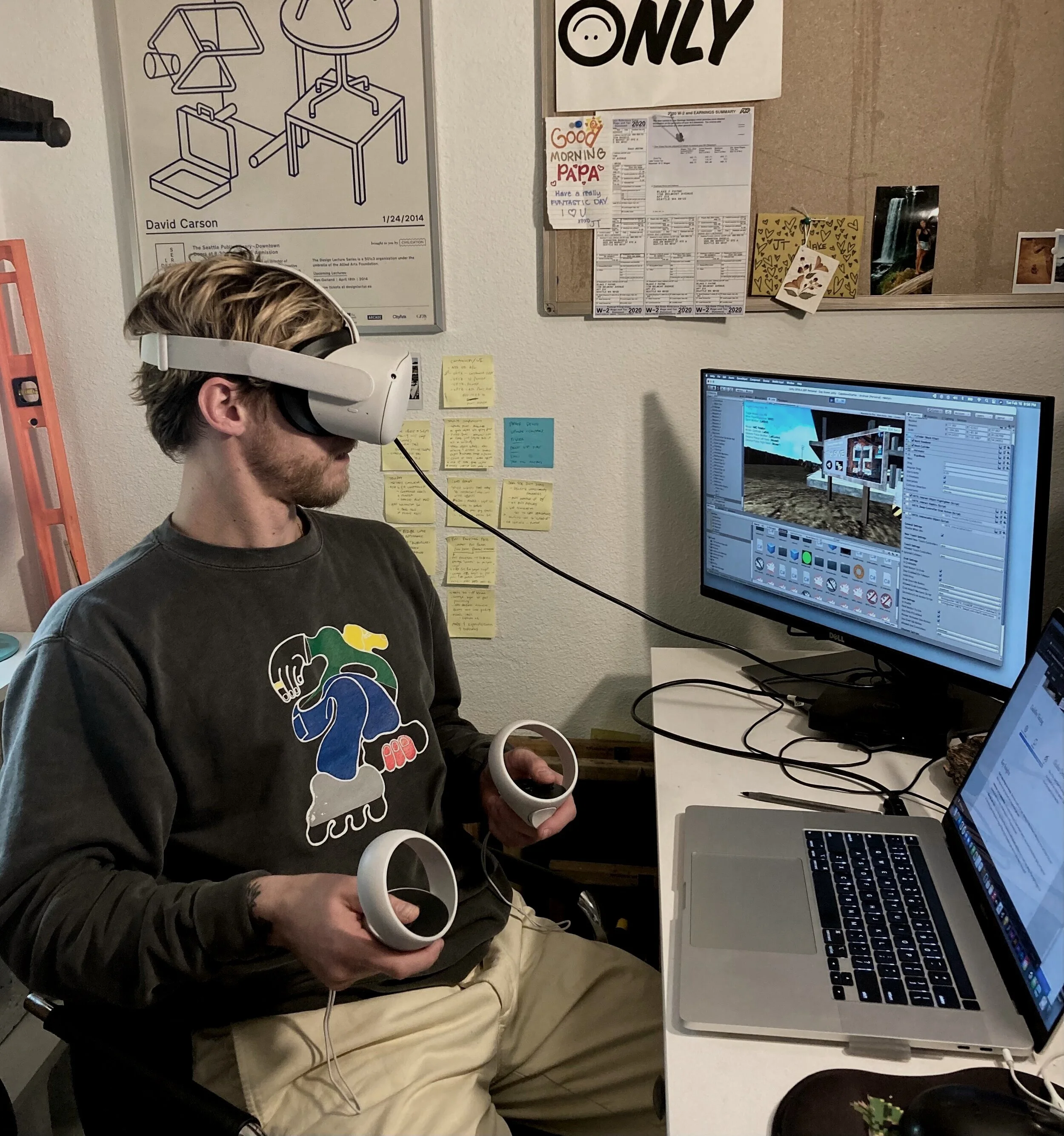
One of the more stagnant and repetitive processes of this project was testing the product on an Oculus headset.
Due to COVID, I was only able to test by myself on my machine.
Key Insights
Don’t make things too complex - Generate a path for the user. Having too many features available at once can fluster the user. Many features can get bypassed and simply never get used.
Immersion can be disorienting - It is crucial to test sound, lower teleport speeds, use smooth teleportation delay, and test the experience with more than one demographic or VR experience level.
Give the user tasks - It can be easy to enter the experience, walk around, and think they’ve seen everything. How might create fun or interesting goals to keep users engaged? Moving the flammable gas can to a safer area in the scene?
High-Fidelity VR Experience
Next Steps
More Testing - Had it not been COVID times, I would have liked to test this with a range of users including my friends that work in construction.
Add Light Baking - Light baking is key to having a smooth running experience. Unfortunately, this scene was too big to add baked lights on my machine. Unity would crash every time.
Make it fun! - Add more fun interactive tasks or games to the scene, enticing users to return to the experience and play longer.
I added a Post-Processing Volume to the scene like Bloom, Color Grading, and Ambient Occlusion to make it look more realistic.


