Client:
The Creative Cabinet
Role:
UI Designer
Project Duration:
3 Days
Tools:
Slack, AdobeXD, Zoom, Google Meetup, Google Forms, Google Slides, Jira, Github
Project Summary
With the growing pressure of national accountability from elected officials and the nearing of the presidential election, the client was in need of some out-of-the-box tools to add to this year’s election process. Our team created a tool to help the lowest-percentage voter groups get to the polls or ballot stations in the upcoming elections.
Design Team Members:
Kayla Graves, Stuart Hancher
DevOps Team:
Tony Yu, Leah Davis, Lucian Nicolescu
Where can we help?
The Project Goal
To design and create a functioning digital tool to empower users to vote.
Define our user group/s.
Users need a better way to access the information they need to participate in the upcoming election.
How might we help the younger population get their vote in and their voice heard?
Research
Market Research
Looking At Voting Apps on the Market
User Research
Exploring How Users Absorb News
Individuals Feel Politically Disconnected
Understanding User Information Constraints
Programmer Research
APIs Had Restrictions
APIs - How It Returns Information
Time Constraints For Limited Features
Who might we be designing for?
Research played a big role in compiling data to help define our user. With the quick deadline of this project, our team developed a Proto-persona to refer back to throughout the design process. Our team would be creating a solution for David.
The Design Process
Feature Prioritization
Our design team wanted to provide many features for our users, but upon weighing our proposed features against time and technological constraints, we decided the MosCow method would help decipher which were completely necessary .
As a result, eliminating the use of a news feed API and push notification did not support the overall goal of our user.
Ideal User Flow
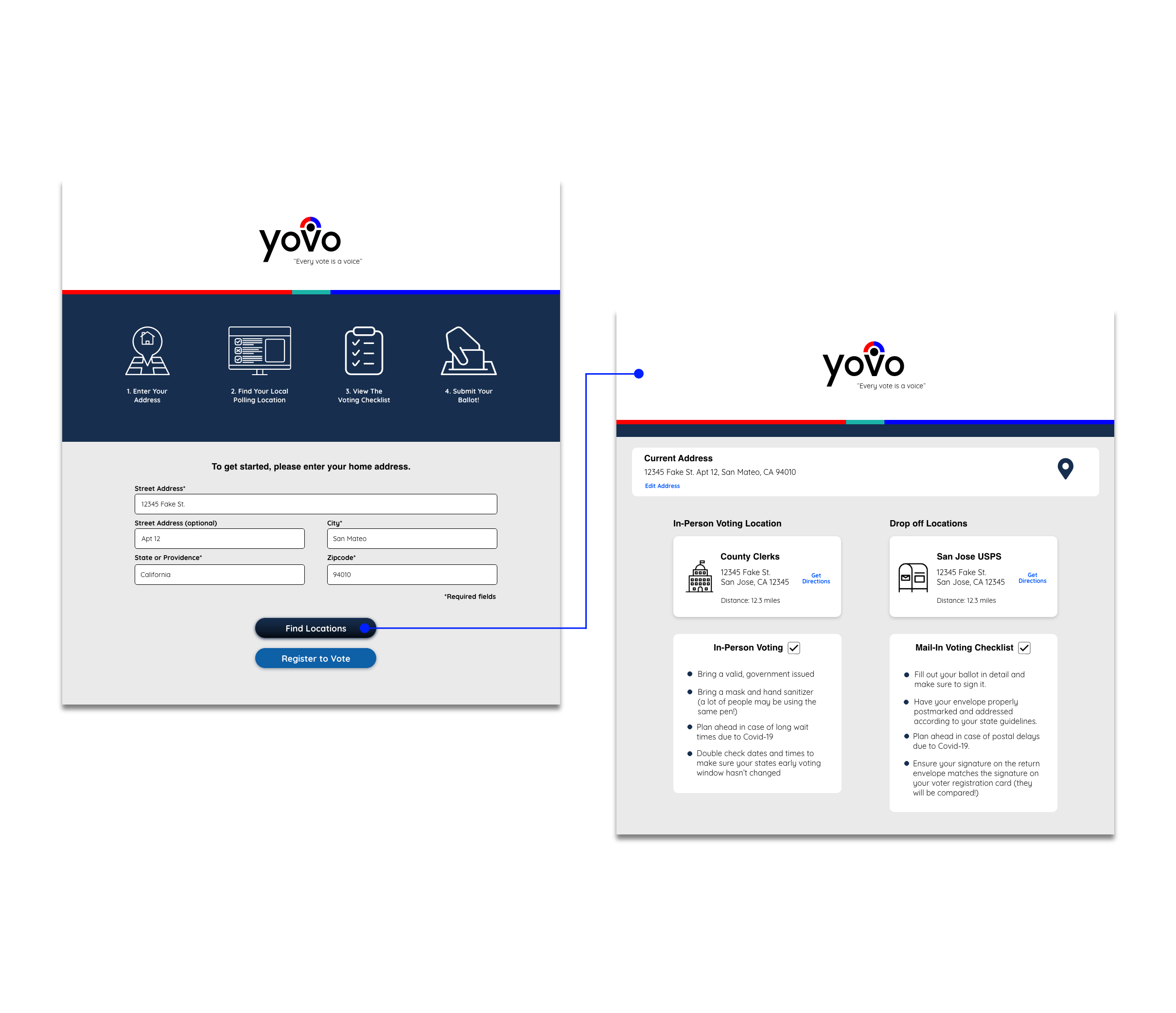
In an effort to avoid account creation, our team made the very first step for the user to simply enter the mailing address they registered to vote with, regardless of voting method.
The user would then be taken to a screen that displays both early and day-of voting locations in addition to mail-in voting drop-off locations, depending upon the address entered.
MVP Design Decisions
After making sure we were providing the needed information for our users, we met with the developers to go over our design to make sure we were designing something that fit David’s needs, but was also feasible to program in short time.
We first started with separate screens for the onboarding and address form field thinking of a step-by-step instructional process.
Talking with the development team, it made more sense to condense that information into one screen due to time constraints of the project and skill level of our Development team.
Mobile Version
Looking at the following screens, we again condensed information making it less task-based and easier to navigate for our users with the idea of responsive web MVP.
Moving into a higher level of fidelity, we organized the information so users could again easily scan and find the location and checklist that pertained to their area.
Talking with the developers, they had mentioned the difficulties of providing an embedded map versus the server’s
Developer Handoff
We met with the engineering team to explain our final design and the reasoning behind any changes that were made. We leveraged the developer prototype tool that Adobe XD provides which generates a style guide, specs, and redlines the prototype pixels.
From here engineers were able to make necessary changes and put the finishing touches on the initial wireframes.
Client Feedback
The client found our product to be clean and concise.
The client would like to see the checklist downloadable to take to the poll or voting location.
The client would imagine this would be great as a mobile application versus a responsive website.
The client would also like to see options to register to vote through third-party sites.
Further UI Design
After getting valuable feedback from senior designers, I decided to implement our mobile product into an iOS application. This application would become a better designed solution for our target users, young adults around the ages 18-29. Improvements consisted of clean UI, improved information architecture, and app navigation for ease of use
YOVO App Wireflow
Added Features
Account Creation
Account Creation Security
Interactive Onboarding
Options to Register to Vote
Unbiased News Feed
Relative Visual Diagrams
Navigation
Calendar of Local Events
Local Event Information
Favorites
Search
Sharing Options
Downloadable Checklist
Embedded Map
Proposed Next Steps
After the 72 hours, the team had a full 10 minute client presentation and a basic functioning product to showcase. However, working with our developer team, the short-term deadline would render a handful of next steps for each the UX design team and our Development Team.
UX Needs
User Interview Research and Usability Testing Analysis
Integration of Political News Feed API
Voting Registration Feature
Dev Needs
Further API Testing
Data Sorting to Display Further Information
Testing Embedded Map
Implementing Sharing Tool


